PSEUDO IR
Clive R. Haynes FRPS
There are several methods by which the delights (and vagaries) of Infra-Red film may be simulated using 'Photoshop'.
Those of us who have explored various options have our favourite methods of working, however most methods have a great deal in common. Typically this will involve the blurring of a layer and the subsequent mixing or 'blending' of this layer with the underlying image.
Two methods I favour are outlined below, neither one is better than the other, neither is my method superior to any other. The method one chooses is that best suited to the image, individual working practices and the pre-visualisation one has for the image in question.
Two other methods are described by colleagues of mine - see 'Related Topics' at base of page.
This method does not replace IR film (as it records light we can't see) so it's best to consider the 'IR Effect' as a means of rendering an image to reveal that essential ethereal magic, buoyancy of light and mystery that is imbued by the use of traditional IR film. In many respects the method is more flexible than IR film but it should be seen as a different and complementary method - not as a direct replacement to or competing with film.
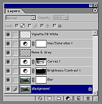
The major image changes are shown at the end of this piece as step-by-step stages
To Begin
I am assuming that we're beginning with a colour image. If the scan is monochrome, you will need to change the Mode to RGB Colour for some of the options that follow to operate. (Do this via Image > Mode > RGB Color).
Open / scan the image.
Copy the (Background) image created to a new layer (above).
Working with the upper (copy) layer just created, make an Adjustment Layer (For P6 - by clicking on the Adjustment Layer icon at the base of the Layers palette - it's a small circle half black, half white) / (For P5 & 5.5 go via layer > New Adjustment Layer and click the drop-down arrow by 'Type'). From the drop-down menu, choose Hue / Saturation. In the dialogue box, slide the Saturation setting over to the left so as to desaturate the image). Click OK.
Blurring the Image
Return to the 'Copy' layer. Go to Filter > Blur > Gaussian Blur. Move the slider and put a fair amount of blur on. Some experimentation is required as the amount will vary from image to image. Anyway, make it pretty blurred (try around '25' to '35' on the slider to start) Click OK.
Change the blend mode for this layer to 'Lighten' - you will immediately see a sort of IR radiance and glow.
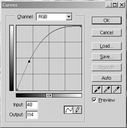
Create an 'Adjustment Layer' by clicking on the Adjustment Layer icon at the base of the Layers Palette (described above). From the drop-down menu, choose 'Curves'. Move the shape of the curve to look something like this: -
Click OK.
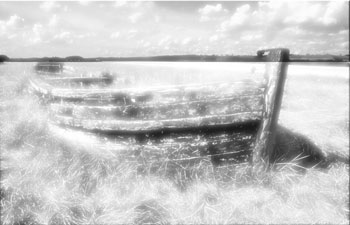
A fairly amazing glowing aura now appears perhaps with 'sparks' of foliage'
Working on this Adjustment Layer, use a suitable brush with appropriate pressure and with black paint (Foreground) and white paint (Background), 'paint' areas of the image for emphasis / de-emphasis as required. Swap between black & white f/g b/g colours as necessary to erase and 'paint back'. (If you're uncertain about the principles of this go to 'Delving Deeper Into Layers' see link below)
Options
Shading
Should you need any shading on the image, then create a new 'top layer' and apply 'gradients' to this. Remember however, that if 'Toning' is applied, you'll need to place the 'Gradients' beneath the 'Toning Layer' otherwise they'll not be toned.
Grain
Grain or 'noise' may be added to the image by inserting another layer, above all image and gradient layers and filling with 'Gray' - go via Edit > Fill > 50% Gray route. Make certain that the 'Preserve Transparency' box is not ticked.
The picture turns grey - Don't worry! ….. Follow on............
Choose 'Overlay' blend mode for this layer and the grey disappears!
Go to Filter > Noise > Add Noise > Gaussian choose 'Monochrome' and adjust the settings until appropriate for the image.
Toning
Should you wish to tone the image, using 'Colorize', create a new Adjustment Layer as the 'top layer' (above the 'Grads' layer if there is one) and choosing Hue / Saturation, click the 'Colorize' box and adjust to suit.
As an alternative to 'Colorize', the image can be changed to Monochrome (via Image > Mode > Grayscale route) and worked on as a 'Duotone', 'Tritone' or 'Quadtone' - Click here for details Toning & Duotones.
Borders
Vignettes and borders can be added to aesthetic requirement. For more details click here Borders
Sharpening
'Unsharp Mask' may be applied if needed.
Pastel Colour
The original colour image can be left in the 'background' and gently re-introduced as a hint of pastel colour in required. Do this by reducing the Layer Opacity for the first Hue/Saturation adjustment layer created.
An alternative method
Using 'Channel Mixer' to refine the tones chosen
Another method of working, which may be incorporated into the one outlined above, is as follows.
Open the image.
Copy to a new layer
Make an 'Adjustment Layer'
Choose 'Channel Mixer' from the drop down menu
Click (tick) the 'Monochrome' box.
Adjust the sliders to give the most satisfying IR effect - light foliage & grass tones etc. (try Red - 70, Green + 200, Blue +10 to start).
From this point follow the route above from Blurring the Image.
Further Refinements
Clipping Groups
Other 'Adjustment Layers' / 'Channel Mixer' layers may be added to deal with the tone and appearance of individual areas of the image. Remember that Clipping Groups will need to be made to constrain the adjustments made to individual layers or groups of layers.
NB. If Clipping Groups are not made, the entire image from the Adjustment Layer down will be affected by changes made.
See separate notes on 'Clipping Groups' go to 'Delving Deeper Into Layers ' - see link below.
.
Select - Colour Range option
As an alternative to using 'Channel Mixer', a method of selecting areas and tones to be worked on is via Select > Colour Range.
In the dialogue box that appears adjust the chosen areas by using the eye-dropper and 'Fuzziness' setting to include the coverage required for the effect needed.
Clicking OK', makes the areas so chosen into a 'selection' which can be 'Feathered' to the desired amount and changes applied.
To be honest, the 'Colour Range' method is unpredictable and tricky but with the right image, the results are worthy of persistence.
The Pseudo IR technique has many areas where additional layers and masks may be applied.
Be prepared to experiment to succeed - enjoy yourself!
Step-by-step images
 |
 |
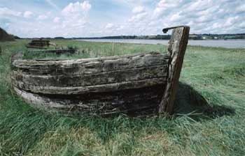
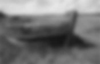
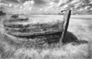
| 1 Above: The original image (copy this) | 2 Desaturating the 'copy' image |
 |
 |
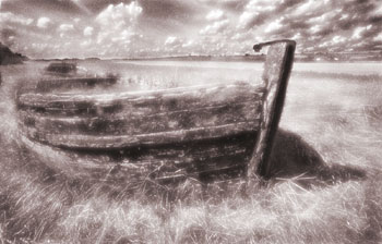
| 3 Blurring the 'copy' image | 4 Copy image layer set to 'Lighten' blend mode |
 |
 |
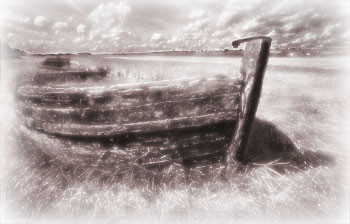
| 5 Using 'Layer Mask' to 'paint back' to lower layer | 6 Toning and adding 'noise' (difficult to see as jpg) |
 |
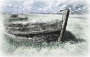 |
| 7 Vignette added | 8 Pastel variant of image |
Below: Layers for the image series above
|
RELATED
TOPICS
|